

[Store Listing Experiment] +16% Installers with New Logo

I’ve had a logo that I created for a long time. I think it’s great, but it’s never had a great reception with friends. So as my process for these things usually goes, I spun up a Store Listing Experiment. These are A/B tests that you can run directly in Google Play Store’s Developer Console.
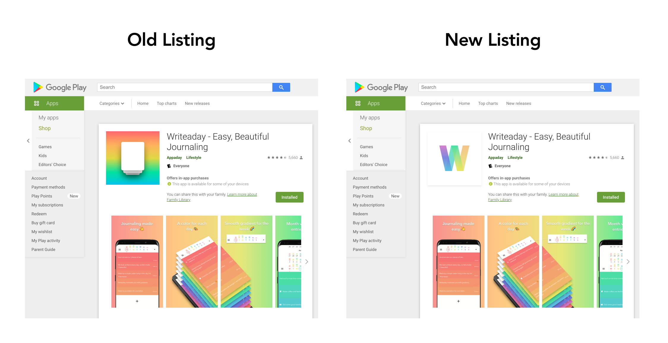
My brother (who conveniently happens to be an artist/ux designer/leather craftsman) designed me a new logo and I put it up against my logo:

Here’s how it actually looks on the store listing:
Results

This works out to a +16% improvement in first-time installers.
(71 - 61) / 61 = 0.16 = 16%
Conclusion
Should I be surprised that my engineering ass wasn’t able to make a good logo? And that my brother the designer was able to whip one up in a few minutes that performs better?
Probably not.
Update: Feb 7, 2021

This logo change roughly matches up with the timeline for this huge change in store listing visitors vs store listing conversation rate.
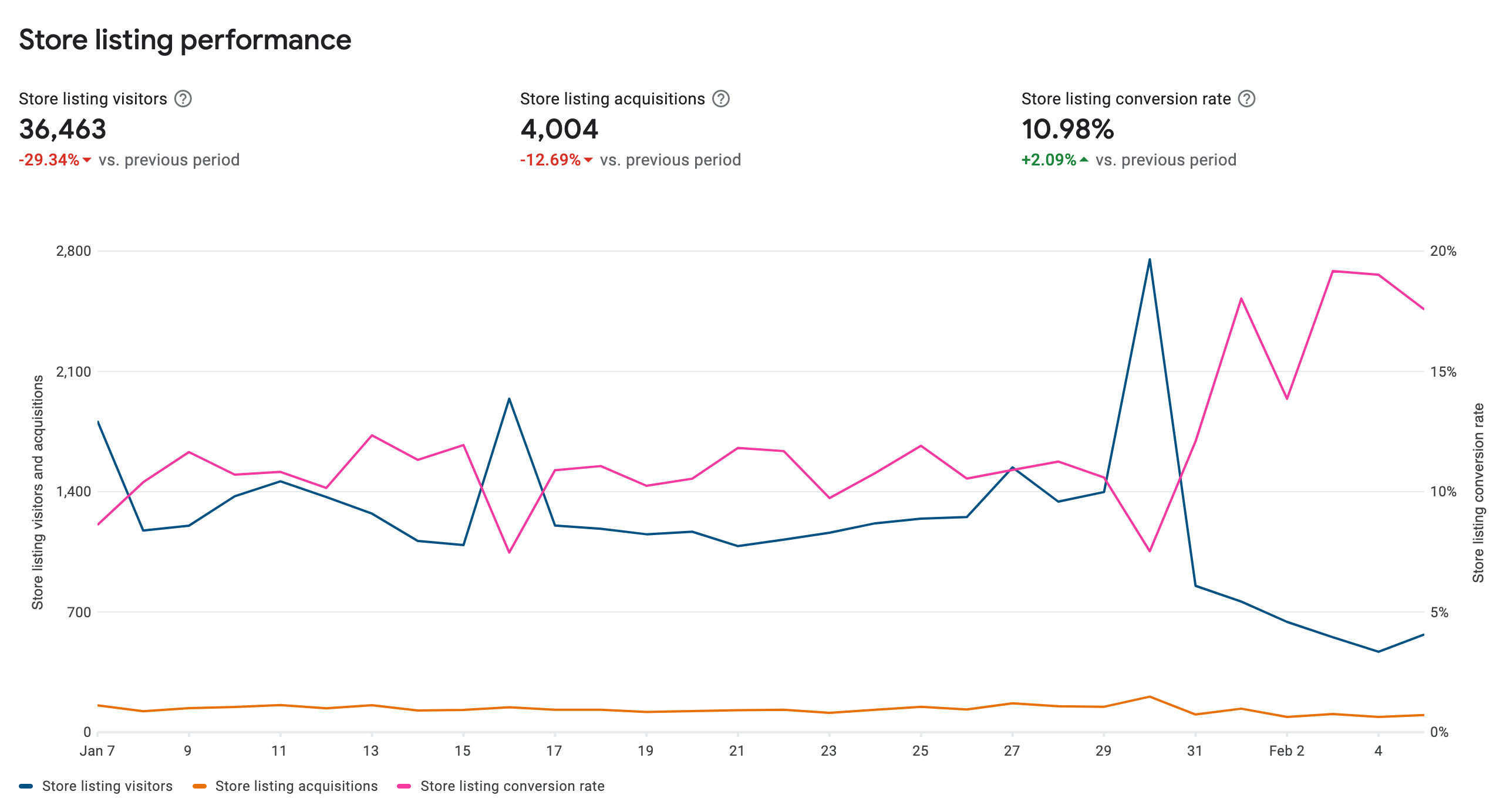
This seems to imply that the logo change caused less people to click in. But those fewer people converted at a greater rate.
Update: Mar 2, 2021
Final results rolled in! +1.3% to +31.2%, which makes for an average increase in first-time installers of +14.95%
